Give your website visitor a new look.
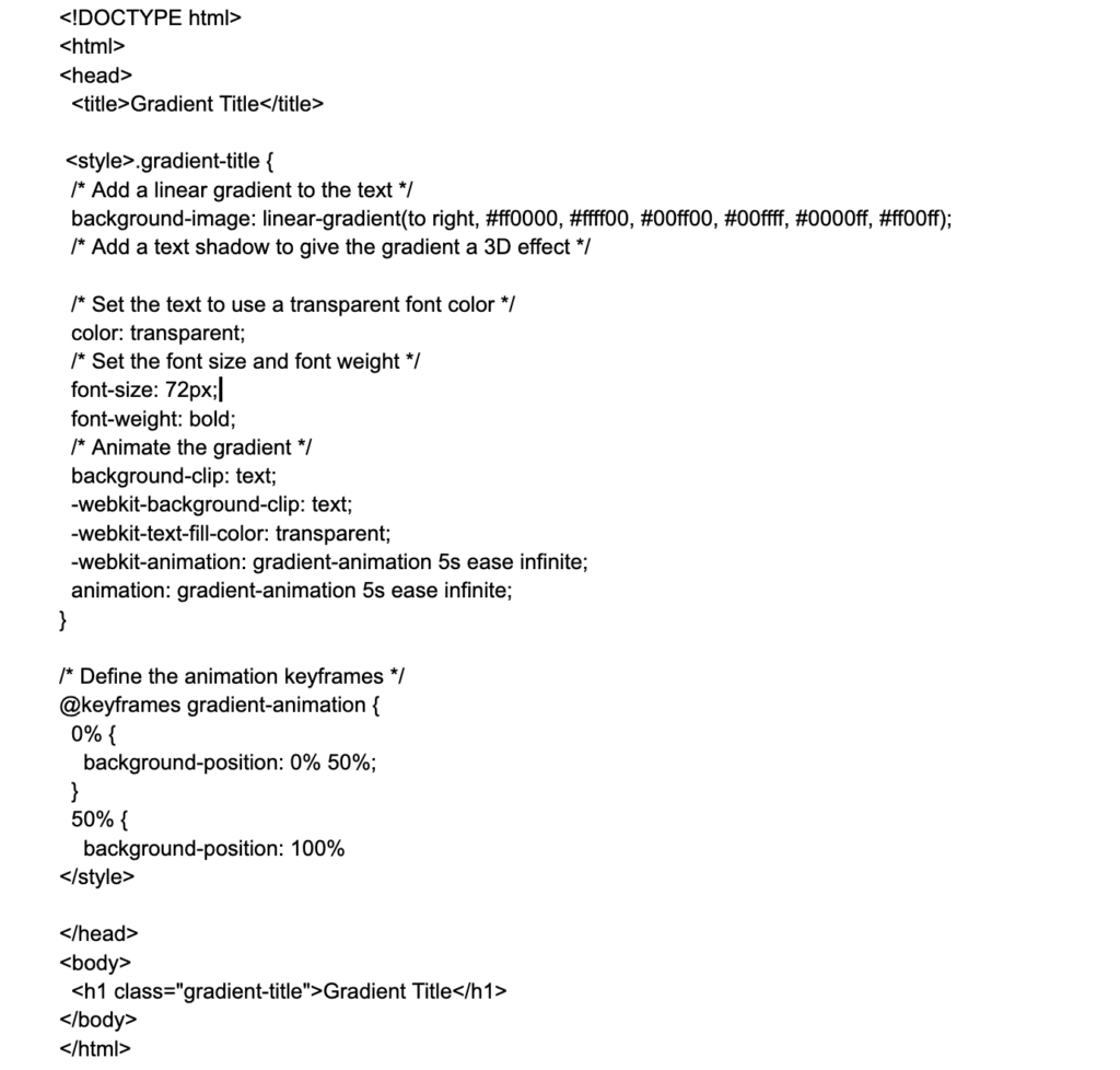
Gradient titles are a stylish and visually appealing way to add depth and dimension to your website’s headlines. In this tutorial, we’ll show you how to create gradient titles using CSS code.
To create a gradient title, you’ll need to use the background-image property in your CSS code. This property allows you to specify an image as the background of an element. In this case, we’ll be using a gradient as our background image.
Here’s the basic syntax for using the background-image property to create a gradient title:
h1 {
  background-image: linear-gradient(to right, #ff0000, #ffff00);
  -webkit-background-clip: text;
  -webkit-text-fill-color: transparent;
}
Let’s break down this code to understand what’s happening:
- The
h1element is the HTML element that we’re applying the gradient to. This can be any element that you want to use as a title, such as anh1,h2, orh3element. - The
background-imageproperty is set to a linear gradient that starts at the left side of the element (to right) and transitions from red (#ff0000) to yellow (#ffff00). You can customize the direction of the gradient and the colors used by adjusting the values in thelinear-gradientfunction. - The
-webkit-background-clipproperty is used to clip the background image to the text of the element. This is necessary to create the gradient title effect. - The
-webkit-text-fill-colorproperty is set totransparentto make the text of the element transparent, allowing the gradient background to show through.
That’s all you need to create a basic gradient title! Here’s a complete example of a gradient title in action:
<h1 class="gradient-title">Gradient Title</h1>

<style>
  .gradient-title {
    background-image: linear-gradient(to right, #ff0000, #ffff00);
    -webkit-background-clip: text;
    -webkit-text-fill-color: transparent;
  }
</style>
You can also customize the appearance of your gradient titles by adjusting the font size, font family, and other CSS properties. For example, here’s how you could create a gradient title with a larger font size and a different font family:
h1 {
  background-image: linear-gradient(to right, #ff0000, #ffff00);
  -webkit-background-clip: text;
  -webkit-text-fill-color: transparent;
  font-size: 48px;
  font-family: "Helvetica Neue", sans-serif;
}
You can even create more complex gradient titles by using multiple colors and directions in the linear-gradient function. For example, here’s how you could create a gradient title with three colors that transition from left to right, then from top to bottom:
Gradient Title